Your personal Tumblr library awaits
Tutorial - Blog Posts
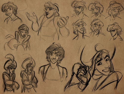
Tips on Likeness: 1. Basics
Today(Jan 4 2016), I’ll be replying to as many questions/messages as I can, and a several of the questions so far, require a tip/tutorial posting for each. Here is one of them.
akiira-lee asked: How do you draw a character from any angle looking the same?For example, how do you look at a photo and see the character from the front and be able to draw him ¾, but still looking the same?
The biggest factor in capturing the likeness of a face in any given angle is in correctly studying the proportion of the individual’s facial features in relation to one another. If you study different faces in comparison to an evenly proportioned face (using loomis method), most individuals have certain features that stand out. These are the features that create unique/memorable proportion of the individual’s face that you need to capture in order to get the likeness. Sections to look for the unique proportions (simplified): - overall head shape - T-zone of the face (eyes, eyebrows, nose, mouth) - Jaw size - head size (hairline above and below) - Ear size ** look for width, length, and overall curvatures in proportion

Exaggerating this unique proportion of the face will enhance the likeness to that person as long as you don’t completely disrupt the rest of the relative proportion of the other features. This is also why good caricaturists are able to capture the likeness of the person even when they go for extreme proportions because they focus on exaggerating the unique proportion that’s already in that person’s face.

(art work by Pete Emslie)
Once you figure out the unique proportion of the person’s face, then you need to figure out the detailed characteristics of each features. There are too much for me to cover in this one article, but the main point is that, You need to separately study different types of each features such as: ( eyes- eye brows- nose- mouth- Jaw line- Cheek line)

Practice each types in different angles. If you’re having trouble with figuring out the angles, pick an actor or actress with the type of feature you want to study(e.g. droopy eyes), and find a video clip with them in it. Pause the video on different angles for you to practice off of.
With the individual’s unique proportion and details of the features in mind, now you need to place the features on to a strong base structure of a face. There are different theories and methods for drawing a base structure for a face. I personally recommend studying the “Loomis method” by Andrew Loomis.
Step by Step:
1. Draw the base structure in multiple angles. 2. Rough-in feature locations. FOCUS on the unique proportion. 3. Render in the features. FOCUS on the detailed characteristics of each.

If you stare at a person long enough, your eyes get accustomed, and what used to look unusual to you get familiarized and no longer stand out. Thus, to capture the likeness of an existing individual, instead of only referring to a single shot image of that person, studying a group shot is a lot more helpful. This is because if you use a group shot, the contrast between different faces will help the individual’s unique features to stand out constantly.
This may seem like a whole a lot of steps and things to keep in mind just to draw one face but eventually with practice, you’ll get to a point where you no longer need to take all the steps or spend as much time in figuring each out.
To conclude this long-ass post, I would like to say that, while these are all important skills to practice, also keep in mind that capturing the high level of likeness in face and keeping it consistent is not always the number one priority unless that’s the main focus of the type of work (e.g. portraitures). Some professionals have to balance out how much time they spend on likeness of the face and rely more on broader elements like, colour, hairstyle and outfit in order to spend more time on other areas of the work such as composition, character acting and cinematography depending on the type of work.
So ya.. it’s important but don’t beat yourself up to the point of hating your own work ( - v-)
*dies slowly since there's no way to send an anon message* Would it be a bother if I asked how you make your sprites? ((Or whoever makes them, sorry!)) they look amazing and I'm really curious by the style!
Aww, thank you! It’s not a bother at all! I do the same process I use for my non-pixel art drawings: I sketch something, then I do the lineart using only one color, then I paint the drawing using flat colors, after that I add the shadows and the lights, and then I recolor the lineart so the lines blend better:

I’m pretty amateur with pixel art, so I only know a few things, but one of the most important things to consider is to avoid messy/jagged lines, here’s an example from this thread:

Also, one of the best pixel art tutorials in my opinion would be this one. There are a lot of tips on how to properly shade sprites in order to avoid “pillow shading” and bland color palettes.

Dearest Kisu, the characters you draw are always full of like and dynamic! Do you have any tips to draw more dynamic characters/poses ? I love your art so much, you're such an inspiration to me
1. The action line:
It’s a line that you use when you create the posing that will help you translate a strenght/ an intention and give “a direction” to the body.

2. Perspective
It can help making a posing more dynamic if you vary angles, perspective and directions
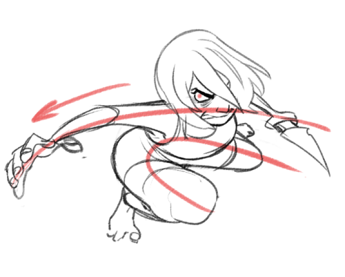
3. Don’t be shy, exaggerate!
That’s how you really can translate mouvements through drawings!
4. Try to avoid “mirrorl” stuff.
It works very well when you want to do artistic stuff (like tarot card aesthetics) but not so much when you want it to look lively.


(Making hair and clothes flow help a lot too hahaha)
5. Try to do “one stroke” line so it doesn’t “break” the mouvement

Painting Fur Step by Step Guide
Artist: Tim Von Rueden (vonn)
Fur can be tough, so be patient and don’t rush the details. If you really analyze the movement and shaping of fur, you can see how intricate and fluid it can be. So instead of creating individual brushstrokes to represent fur or drawing triangles, instead work with layering the shapes and keeping the flow moving in a general direction.
For the full explanation, tips, and free downloadable guide, Check it out HERE!
how did you figure out how to do hands
well when I do hands I tend to break them into 3 big shapes
starting with the wrist then palm, thumb then the fingers

once I have the big shapes in I separate the fingers

here are some more examples of the different parts

one of the best ways that I learned how to draw hands was to draw a LOT of them, in different poses, while looking at a reference. This is a site that I found useful,
it has 3D models of hands that you can change the view so you can see the same pose from different angles. p.s. this site i linked to does contain nude figures just a heads up

MidnightPanther asked for a texture tutorial on the Firealpaca group on Deviantart, so here’s one I put together in 10 minutes (sorry if it looks a little crappy). Deviantart doesn’t let me post a tutorial as .gif, so I can’t xpost :( I hope this is useful! *goes back to drawing Color swatch meme*

Simple brush tutorial by catnappe143 for Paint Tool Sai.
This is a similar process to how I do grass in Photoshop.
http://catnappe143.deviantart.com/art/Bush-tutorial-363593214
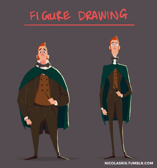
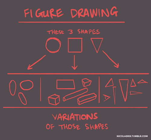

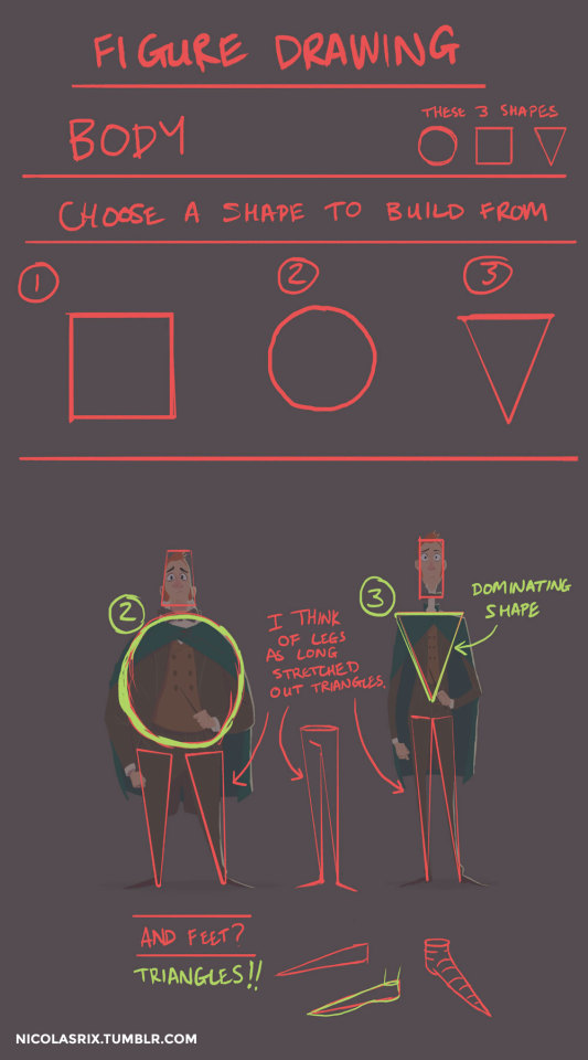
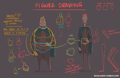
@curdalert, asked me a few weeks ago, “How do you approach figure drawing?” While this isn’t really figure drawing in the traditional sense. This is just me trying to show how I see the human form, how I simplify things for myself to understand it enough to move past all the bullshit and difficulty of drawing. I’m by no means an expert on anatomy. I don’t know all the ins and outs of every damn bone, ligament or muscle. It’s all too much. A lot of this I learned from sifting through tutorials and browsing the internet. But figure drawing itself in the traditional sense is more about capturing the form. The force and flow of a pose. But I do keep a lot what I’m showing here in mind when I’m drawing from memory. I should however be doing a lot more life drawing, which is like zero at the moment. What I’m showing here can help de-mystify the human form a bit. So basically, this little tutorial I threw together is really about these 3 SHAPES and how everything is a mix of those 3 shapes. No magic. No abiding by rules of how many heads fit into a body. It’s all just shapes. Hope this helps. If there’s anything else you’d like to know, please send me more questions and I’ll do my best to answer them :)
Pixel Art Tutorial
Note: This tutorial was created in 2007 for my personal website. Some small tweaks have been made since then, but nothing too significant. In this 10-step tutorial, I’ll teach you how to create a “sprite”, which is a stand-alone two-dimensional character or object. The term comes from video games, of course.
Creating pixel art is a skill I picked up because I needed graphics for my games. After a lot of practice, I became kinda handy with it, and started to see it more as actual art rather than just a tool. These days, pixel art is quite popular in game development and illustration.
This pixel tutorial was created many years ago to teach people the basic concepts behind pixel art, but I’ve streamlined it a lot since its first incarnation. There are other pixel tutorials around, but I find them to be overly-complicated and too wordy. Pixel art is not a science. You should never have to calculate a vector when doing pixel art.
Keep reading


CLOSING THOUGHTS
- Start small. - Make mistakes and try new things. - Practice as much as possible. - Share your work with others and get feedback. - Study the work of the artists whom you admire. - If you don’t have a tablet, get one. Small ones are cheap and easy to carry around. - Have fun!


Tutorial: Expressions~
First off, I gotta start off with the typical Disclaimer.
*ahem*
This is a tutorial based off of MY knowledge and MY experience. My advice is just that, advice, and is not is anyway, shape or form, absolute. I am still learning and do not consider myself a professional or expert. Look at other sources, look at other materials, expand your inspiration, don’t just look at this tutorial and call it good. And most importantly have fun~
Alright, with that out of the way, before I can get to the actual expressions, we need to discuss an important concept known as “Squash and Stretch.” You’ve probably heard of it before. Squash and Stretch was a method that was invented (I use this term a bit loosely) by Freddie Moore, a Disney animator from the 1930s to 1940s. He was the animator for the Dwarves in Snow White and he gave these characters a spongy flexibility that made them feel more real and gave pliability to the face that made them come more alive.

Even outside the world of animation, Squash and Stretch is essential and you’re going to squeeze much more life out of your characters if you understand and are willing to push the weight and flexibility of their faces. This also doesn’t only apply to cartoons, look in the mirror and make funny faces and strange expressions and you’ll notice how squishy your face is.
The next concept to be aware of is the Acting Elements of the Face. This is a concept I never really thought about until I read Tom Bancroft’s Character Mentor, a book I have recommended many times. The Acting Elements are the basics of character expression and focuses on breaking down the elements of the face in order of importance to properly communicate an expression to the audience. These are not set in stone and a lot of times their order can be switched around depending on the expression. This is the default order Bancroft uses in his book:
1) The eyes
2) The eyebrows
3) The mouth
4) The neck
5) The nose
I’m not going to go into much detail about this; otherwise this tutorial will run on forever, so DEFINITELY give Character Mentor a look for a better understanding.
Here are some expressions I whipped up, notice the different ways each of the above elements contributes to the overall expression. Try to identify which element is strongest in each one. Also notice how some elements repeat (such as the use of the eyebrows in the bottom two) but they’re still different expressions.

I personally find that I always build from the eyes out when building an expression. Ever heard the phrase “The eyes are the windows to the soul?” well guess what? THE EYES ARE THE WINDOWS TO THE SOUL! This is why people look away when their embarrassed, why their gaze shifts when they’re lying, why their eyes grow wide in awe. It’s what makes a hero seem cold when they hold their gaze at the display of heartless behavior or gives a villain a moment of redemption when they turn away from a cruelty.
Part of the reason why Glen Keane’s characters are so incredible is the way he expresses a character through their eyes. He says “If you’re going to make a mistake, don’t make it in the eyes. Because everybody’s looking at the eyes.” He creates these characters that are filled with passion and before that passion translates into body language or into an expression, if bursts out through the eyes.


Remember when I brought up that the order of the Acting Elements is flexible? As I said, I tend to start with the eyes when expressing and character but sometimes that just doesn’t “work” with the character. Take a look a Max, from Cats Don’t Dance (if you haven’t seen the film, I highly recommend it, even if just for the animation). His face is almost ALWAYS in the same position, with the same expression, completely stiff. The only thing that moves is his mouth and it’s animated in a way that is both comical and intimidating! This is a common theme with his character, fluid motion against unmoving bulk. It contrasts and guess what? Contrast creates interest! <—-Remember this phrase, because it applies to everything!

Next, pushing your expressions. Don’t be afraid to add that extra “umph” to a characters expression. Unless you’re animating, you don’t have the luxury of constant motion and steady frames, so make the most of a scene, make it clear to your audience what your character is feeling. Check out some of these simple examples below.
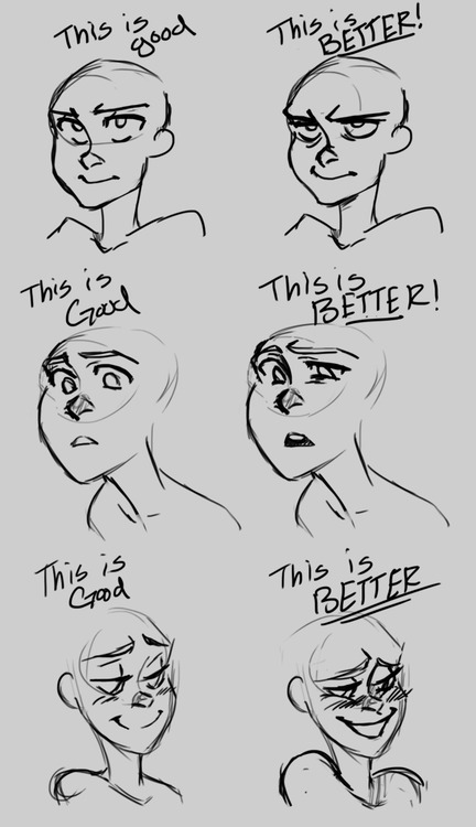
Now some of you probably thought the first expression was better than the second. And you know, you may be right! Sometimes a subtler expression speaks volumes more than a more obvious one. It’s important, however, to understand to how to make the most use of your character’s face. But in the end it all boils down to the character. Which leads me to my final segment of this tutorial…
A character should express themselves through their emotions. Just like costumes, colors, body language, etc. expressions are ultimately a tool used describe a character, to visually tell a story about them. When dealing with different characters, try to avoid “recycling” expressions, ESPECIALLY in the same scene/picture/moment. A good exercise is to draw two or three different characters with the same emotion but give them different expressions.
Or better yet, draw them reacting to the same situation.
Your goal should be to make each expression true to the character. Their expressions should tell the audience something about them. The same way you might bold a word or phrase to emphasize its meaning, a character should express themselves in ways that emphasize who they are.

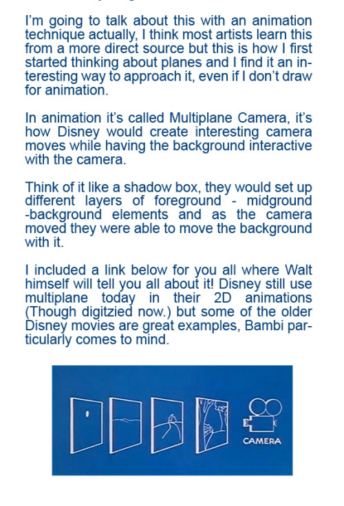


Walt Explains Multiplane Camera
I’ll also do some notes on perspective and dynamic posing later. (We’ll see how dynamic posing goes considering I’m not too great at it myself so… yeahhhh.)
Hello! Your newest ink drawing are absolutely incredible and I'm trying to figure out how you did the fur texture (my favorite part!). Did you use a white pen, or is it just about leaving gaps (like it is for the separations between the limbs and body?) Also what pens did you buy those thin lines are so crisp without being too heavy and im intrigued
the texture is made with hatching in the (more-or-less) direction that the fur would grow. I'm not overly worried about keeping it realistic, as long as the texture and values are to my liking. here's a closeup of the chimera/kirin creature:

you can very clearly see the press and release of the pen, it's not always perfect! as for pens, I use 005 Microns.

for A5 pieces like the above it's 005 all the way through. when I work on a piece, I usually do it in one sitting, so the line of the pen becomes finer as it doesn't really have time to soak up the ink into the felt tip. I start with the dark areas like horns or muzzles or paws, and work into the main body which will usually appear more faded and thinner.

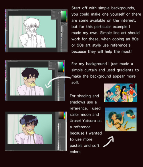
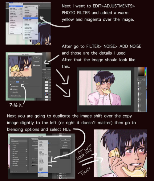
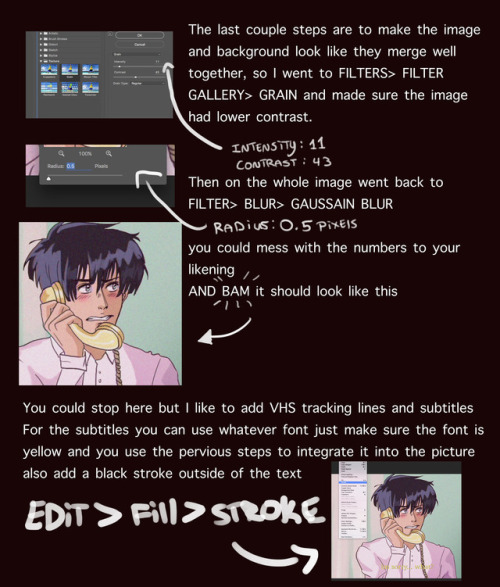
I got a lot of asks about this so I made a tutorial on how I was able to emulate the 80s aesthetic, please keep in mind I’m not an expert and what I put here is just what I personally did. I hope you guys like it and hope it helps
go crazy kids


Eye tutorial
Also have this really quick and short tutorial on how I draw Dark's eyes when I am not a lazy cunt.
Your art is so aesthetically pleasing?? How do you pick colours-


First of all tHANK YOU SO MUCH IM SO HAPPY YOU LIKE ME COLOURS!!! AnD ALSO IM SO SORRY THIS TOOK DO LONG BUT I REALLY WANTED TO THINK ABOUT HOW I DO THIS!! Cause mostly for me this stuff is now second nature!! But it’s all abOUT COLOUR THEORY MY DUDES!! :DD
ALSO THIS IS JUST WHAT I DO I AINT TELLING YALL WHAT TO DO OR ANYTHING!! YALL LIVE YOUR LIFE HOW YA WANT
How to make Memorable content! Creating a Brand
Heres a simple video following the beginning of my process of creating my own brand where I showcase three simple steps to get started.

Thanks for the nice response on my last tut, Under the cut I'll talk more about the specifics of drawing pixel art, I'm not sure how deep is this because I thought of this tutorial as basic knowledge, but please ask me if you want me to explain anything in more detail.
So, since you already know how things work on the program let's talk about drawing and polishing things in the program... Also, I want to add since I forgot with the last tutorial... I'm not the best at pixel art, not even close, I'm still learning, this is not a definite guide and it won't give you superpowers... or maybe it will if your computer is radioactive and you spend a lot of time reading my guide or something... no guarantees of that though, but if that happens don't blame me if your superpower is lame, ok? First of all, let me explain what pixel art is: Pixel art is a subdivision of digital art, where you have control of your image in the smallest level, pixels. That's why pixel art is normally small, so you can focus on all the picture without leaving things to chance. The main thing that I like about pixel art is that the placement of every single pixel matters...

(you can notice clearly how altering the position of 10 pixels make the lines completely different... this is also true for variations in single pixels, but I wanted it to be obvious)
Since it's a subgenre of digital art it has some "rules" that don't necessarily apply to other sorts of digital art. of course you can break the rules, but then you're not really making pixel art... Actually I think it can be condensed to one rule... 1.- Control EVERYTHING: this doesn't mean you can't use the bezier line tool or the paint bucket, but you shouldn't use any kind of filter or blender tool (burn, dodge, blur, etc) as you can't control the outcome... this doesn't mean you can't use a lot of colors, but give every color a meaning in your picture and keep your palette to a minimum... this doesn't mean you can't freehand your lines, but you have to fix them later so nothing is a program choice and everything is placed RIGHT where you wanted it to be. There are a lot more don'ts than dos with pixel art, but you'll find them as you progress... just look at the master's (I admire Syosa deeply, you may find fool, jalonso and mrmo tarius to be freaking awesome because they are... pixeljoint has a bunch of talented individuals posting and offering advice) and join pixel focused sites if you're interested, their forums are really helpful, I post in pixeljoint, they are cool dudes and have helped me a lot. There are two different approaches when it comes to pixel art (or maybe many more, but I have two):
1.- From specifics to general.
This method is basically start with clean lines, and then fill them out and add detail, much like you'd start any picture I guess...
so I start with a sketch...

(all the sketches I'll be showing are at 200% so you can see better since it's so small)
then I clean the lines, I normally just clean the same sketch and then change the sketch color to black so I can see better, but you can make a new layer and work there if it's easier for you... as you can see I made all lines 1px wide fixed all the jagged lines , and basically worked every pixel so in 100% the lines have the correct angles... this was specially tricky in the dress and legs, sometimes just moving one pixel changes the entire meaning of a line...

Then I simply fill the lines with whatever colors I'll be working with... they're not definitive colors but placeholders, but I still try to make them as close to what I want as possible because... well.. I like working the less I can, so if I can pull it off with just one attempt it's great for me... right now this pic has 6 colors

then I put some shade where it belongs, now the pic has 9 colors, I added one darker yellow, one darker orange and a brown... as you noticed I completely ignored the dress colors because I'm stupid and took the screenshot before I worked on it... but I only added one shade of grey for the dress and shaded the lighter part with the darker red.

then I make the lines work in function of the forms, not only as lines by shading them too. I add another darker shade for every color that's touching a line and paint the line also minding the lightning of the picture (using a darker color only for the parts where the shade is, sometimes you can even erase a line if the pic looks better like that, beware of using lights randomly though, that can ruin a picture very quickly...)

then I fix the colors to my liking.. this pic needed some more contrast and better use of saturation in the shadows...

and then I just finish adding detail and put a white border around it because idk... I decided that's how all my animal crossing pixels would look like...

(this is goldie at 100%)
and the other way to work a piece is....
2.- From general to specifics.
With this method I'll start with a very lose sketch, in this step I mainly worry about the gesture and pose, using references is important so it doesn't suck much..

then, I paint with general colors, like, I know the sweater will be greyish and the skin is yellowish, and the hair will be brown and I'll probably recycle that colour in her leggings too... I don't really marry with a palette right now, I just chose general colors and I'll be adding, removing and modifying them as I go...

I also made the pic a little smaller...
And then... I just start detailing... I always start with the face because it's the most important part, I used two shadow tones that will help the yellow look like skin tones...

Never be afraid to move stuff around... after all what you did was just a lose sketch, I worked more on her eyes and changed the shape of the face to match better my reference

The colors evolved a lot since I started and I started refining the shapes and making every pixel count...

I gradually start adding more colors to the palette, first I check the color is not too similar to any of the ones I already have, and then I check if the ones I already have and see if I can make the colors work on other places, normally when you work with greyish colors you can make them work differently when you place them near to other colors... just experiment (or learn color theory, but experimenting is more fun)
this is the palette I had when I first started polishing it...

(all the black slots are fillers, as gale works with limited palettes since the start, you have to manually add colors everytime you want a new shade and if you modify the color, all the areas that are painted with that color will change accordingly... it's super neat to make the colors work together later...)
this is the palette I ended up with, 12 colors + transparency, you may notice I changed the skintones so I could recycle them in the sweater, and the greyish green became less green because that way I used it in more places...

and this is what I ended up with... I flipped it at the end because I liked it better like this...

Hope you find this useful, let me know if something is wrong...
The next tutorial will be about pixel animation I guess, unless you guys have a better idea/don't want to see me post any more tutorials

Since some people asked me to explain how do I do pixel art/show them the program I use, I decided to do both things...some basic info about the program, shortcuts and the explanation for the tools can be found under the cut.
Welcome to this tutorial for GraphicsGale (shortened Gale from now on) I'm sorry if some things don't make sense, english is not my first language, you're free to correct me if you want, I'll try my best to answer questions if you have them. Enjoy.
So, first things first, What is Gale? it's a graphics program by Human Balance co. focused on pixel art, it can be found on it's official site and there you can download it there too. I highly recomend buying it if you liked it, it's not expensive at all and it's awesome.
For this first part I'll just talk about very basic stuff like tools and such, so let's take a look at the program itself.

It doesn't look intimidating does it? I even broke up the menus in pretty colors, yay!
1.- (red) it's a normal menu, like any other program has. I'll be talking about specifics later on, while I explain how to do stuff.
2.- (orange) basic actions icons, it's basically a condensed menu; I'll list the icons, hover up on the words if you want more specific info. New file, Open file, Browse, Save | Undo, Redo |Cut, Copy, Paste | Paste as a new image | Zoom | Grid, Custom Grid, Grid snap | Onion Skin
3.- (yellow) Tools, again, I'll list the icons, hover for a more specific explanation on each icon. Magnifier, Image Mover, Rectangular Selection, Oval Selection, Lasso, Magic Wand, Color Selection, Pencil, Connect line, Spline Curve, Rectangle, Filled rectangle, Oval, Filled Oval, Flood fill, Color Replacer, Draw text | Antialias, Transparent, Paint mode
4.- (green) Layers menu; New Layer, Duplicate Current Layer, Delete Layer, Combine Layers | Previous Layer, Next Layer | Properties of the Current Layer (I don't think I need to explain any of these)
5.- (cyan?) Animation stuff; Add frame, duplicate frame, delete frame | previous frame, next frame | properties of current frame | cut frame, copy frame, paste frame | Play, Pause
6.- (blue) your current document window, here I have a gif with 4 frames opened. as you can see the document only shows me one frame at a time, but if you have the preview window open you can see the animation and you can find the frames in the Frame
7.- (purple) Extras! this is another important part of the program, this program has a lot of specific things that are meant for making your life easier at pixelling, you can call the extras in the menu view, and they are Frame, Layer, Palette, Preview and Loupe, I always have the first 4 opened at any given time as they are pretty useful, I don't really see the point in the loupe, but maybe you will...
Now, some important tips that you may be interested in.
You can dock windows so they're not floating around like I did with the frames window, simply go to the options (the arrow), select "dockable" and drag the window to whatever corner you want, you'll notice the outline changes when it's docked.

You can keep windows collapsed so they don't use space, like I did with the layers and palette, simply select auto hide in the options menu

You can save a lot of time with shortcuts and button mappings, this program comes with some stupid button mapping (for example, ctrl + or ctrl - aren't the default mapping for zooming in and out), so if you're used to another program, you can make them match. Simply go to File > Preferences and change them to your hearts content (or if you dont want to change anything, learn what the shortcuts are)

I hope you guys find this useful, I'll cover basic pixel drawing on the next tutorial...

Cartoon Pouch Tutorial
I messed up the first time I uploaded this and I lost everything I wrote, here I go again...
First of all, I want to apologize for the number of pics, I know it's a shitton of pics, but bear with me, I don't know how to explain some stuff properly, so I need visual help
Here's the stuff I used, I had a mind slip and wrote Fleece, but it's Felt, also, Iron the fabric you'll use before you use it, I took the pic before I ironed it.
Use something as a reference for the size you want, the biggest thing I'll fit in my pouch is my student ID, so I use it to cut the clothes, I'll use the lines to sew so I leave some margin so it's not super tight.
Be sure to leave all the ugly bits facing outside, we'll cover them with the felt later, also the zipper slider should be facing outside too.
If you don't have a zipper foot (or, like me, don't want to search it) simply place the foot the closest you can to the zipper, when you get close-ish to the slider move the neeedle down so the fabric doesn't move (like in the second pic) and lift the foot, then open the zipper, put the foot down again and finish sewing, for the other side you should start with the zipper open and then close it... In the end it should look like the third pic.
Now sew it to make it a pouch, like you can see, the pretty bits are inside.
Now to give our pouch some personality, this is the sketch I'll use as a reference, notice that I planned where the inner pouch will be to avoid making it too big.
Cut the Felt in the shape you need, to cut the hole for the zipper simply place the pouch you just made where you want it to be, secure it with pins and use a sharpie to mark where the zipper begins and ends, then cut the little rectangle.
Now sew this felt piece to the pouch so we have the back ready, to hide the stitches inside use the lid that you got when you sew the zipper, also, try to make regular stitches with a color similar to the felt.
Now, for the front part, cut all the details you'll need, Bidoof needed a pair of eyes, a nose, a tan muzzle, teeth and a light marking, for the Fin I uploaded a couple of days ago I only needed his face shape and eyes.
Sew the pieces in place using regular stitches, also try to kep the same distance between the edge and the stitches at all times.
Now to sew the back and front together you'll need to do the following, I used white felt with black thread in the example so it looks better... Pass the needle to the other side, now try to enter the needle in the same spot you used first, pass though the loop, it should look like a know when you're closing it, now go a little bit higher and do the same kind of knot, you'll notice how you'll get the thread around and on the edge, rinse and repeat until youre finished, my stitches in the example look gross, but you should try to be as regular as posible for a nice look...
And that's the finished example... if you use this tutorial to make a pouch I appreciate a link back, and I'd love to see the finished product too.
Hope everything is clear, but if you have doubts tell me and I'll do my best to clear them...
Cheers!


hey these are some tips for some of the little details in drawing fat folks that some people might not know!
everyone has fat on their bodies so its a worthwhile skill to have, but most art tutorials leave it out. heres some other good tips from artists!!


GoldCanines: “I had lots of questions on how I go about my shading ! ✨
Here is how I pick my colors, determine my layers, and lay out my shading !”
Source: GoldCanines on Twitter